Web Interactivity and Engagement
Just another WordPress site
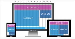
Responsive Grids
In my last post, I mentioned the need for web designers to keep responsiveness in mind when utilizing a grid layout. Content-out Layout from a list apart delves deeper into this concept by describing the process of using ratios and building your grids with relationships as opposed to simple columns.
As that article describes, websites with content that have smaller ratios lead to more subtle differences between each element. Larger ratios between the elements provide more a dynamic or dramatic feel to a website. Keeping in mind the hierarchy between each element of your site and it’s content may help guide designers to decide how the components will relate best to each other and what kind of relationships those elements will have. Utilizing responsive grids as a base for your site layout while knowing what your content may be, will massage the elements into place – like a responsive puzzle, showing users which elements are related or of more importance based on the ratio of the website it contains to other pieces.
The article states, “A ratio-based, modular approach to grids allows us to navigate a medium where we cannot know the container size, nor what type of content will flow into that container.” This excellently describes how a fluid ratio grid based site can transition and be used at its best by any viewer on any device, if the designer is mindful of these things from the onset and builds their websites with this kind of foundation.
As a newcomer to the web design realm, I find these kinds of concepts vital to keep in mind at the beginning stages of any site. The more thought put behind the sites foundation, the better the site can be, and the content can be displayed to the best of it’s ability for the medium.